LIVE: The Boston T Party
I’m a few months late on this one, but I recently wanted to learn about WebSockets and GTFS-realtime feeds. The result: a real-time Boston transit map! I apologize if you were expecting a historical reenactment.
This project was originally hosted on Heroku but is no longer live. You can still check out the source code on GitHub.
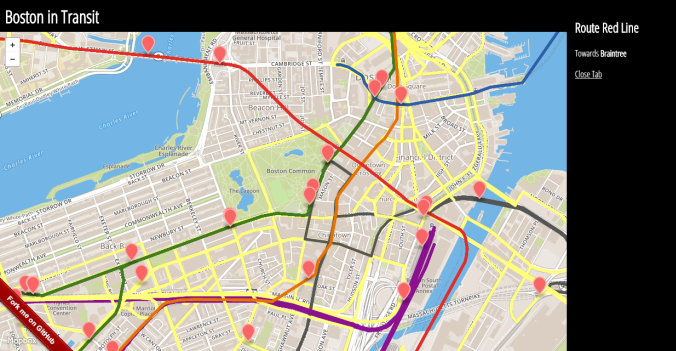
Try clicking on a marker for more information on the subway/bus/light rail/commuter rail vehicle it represents!

The sidebar of the application appears when you click on a vehicle. This area could be populated with tons more info from the GTFS static feed!
How It’s Built
The app runs on a Node.js server that accepts both a socket connection and an API call. Why both? Ask two-months-ago me. A new socket connection is formed when a client (web browser) connects to the server. The server periodically polls for the latest GTFS-realtime update (which the MBTA posts updates to http://developer.mbta.com/lib/GTRTFS/Alerts/VehiclePositions.pb every ~18 seconds) and decodes the resulting protocol buffer using the Google gtfs-realtime-bindings. The decoded data is then broadcast to all socket connections. The frontend client is a simple AngularJS controller which manages the socket connection and updates the markers with the latest vehicle position information.
The basic architecture described until this point can operate completely independent from a GTFS static feed, but this would only produce a bunch of dots on a map which move periodically. Which, don’t get me wrong, made me ecstatic when that was all I had. But linking up a GTFS static feed gives each dot context. I decided to load the MBTA feed into a Postgres database on Amazon’s Relation Database Service using this schema. The GTFS static connection allows for two features: 1) the client issues an API call to fetch the route and headsign when you click on a vehicle, which is fulfilled by the server through a database query, and 2) the colored route lines are pre-generated into a GeoJSON file using a Node.js script which runs a database query to fetch the official MBTA color for each route.

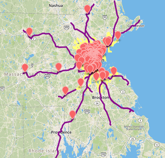
The purple lines represent the commuter rail routes. I chuckled the first time these lines loaded and I kept having to zoom out to see where they stop. To Providence and beyond!
Up Next
The map doesn’t have nearly the feature set of NextBus, with gobs of detail about every bus and stop you click on. I do find it clumsy that you have to select routes to view in NextBus, leading me to make sure all the lines appear at load time in my map (or shortly after (#LargeGeoJSONFile)). Feel free to check out the code or even add features yourself; the code lives on GitHub!
A big maintenance issue with the app as constructed is that it requires a manual reload of the GTFS feed after each update by MBTA which changes any trip IDs. The Green Line trains do not have valid trip_ids in the GTFS-realtime feed, so I programmed the app to display any vehicle with an unknown trip_id (one that did not match with the GTFS static feed) as a Green Line trip. After a GTFS static update, you will often see many vehicle markers say they represent a Green Line train, when we really just need to load the new GTFS feed into the Postgres database. Who wants to automate this for me?
You may not need this map to plan your commute from Back Bay to South Station, but it was certainly a fantastic learning experience for me. Many of its components will make an appearance in my next project! (Hint: it involves representing transit networks as a connectivity graph!)
Until next time, ride on!

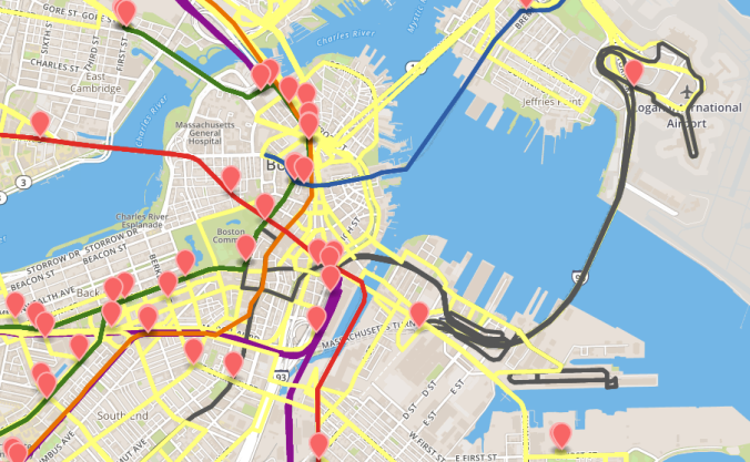
I never get tired of staring at these colored lines until the markers all jump to their next position! The yellow is the official color specified for the bus routes in the MBTA GTFS static feed. Anyone know the reason for this? It also looks like the Silver Line goes a bit crazy right after exiting the Ted Williams Tunnel. Correct me if I'm wrong, but I think this is where Silver Line buses switch from diesel power to trolleybuses?