Graphing Transit Systems, Part III – Centrality Extended
This is the third post diving into the graph structure of the New York City subway system. Read the first two for more background!
At the start of last post, I threw out two questions:
- Does the network structure of the New York City subway indicate Times Square is a critical station, or is that just where the most riders board?
- Can all stations in a transit network be important?
We discussed the difference between centrality metrics and node importance metrics. The former identify important nodes in a network, while the latter ranks nodes by importance. We’ll use the node importance metrics to answer these questions.
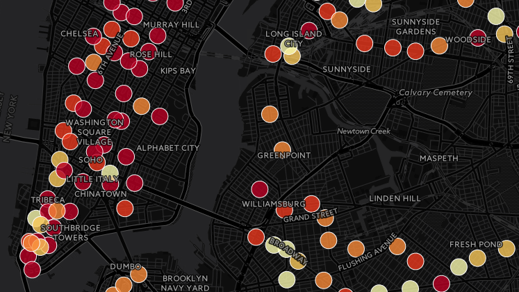
To support our discussion, I whipped up a map showing the MTA subway ridership data by itself using Carto. Here’s the interactive map! The data is from the years 2010 to 2015 and is provided by the MTA.
Does the network structure of the New York City subway indicate Times Square is a critical station, or is that just where the most riders board?
To answer this question, I calculated the correlation between ridership and centrality. In the scatter plots below, the independent variable is the centrality score per station, and the dependent variable is the ridership at that station, averaged over the years 2010 through 2015. This might seem backwards, but I chose this because the centrality metric is a reflection of the network structure and we are studying the effect of network structure on ridership.
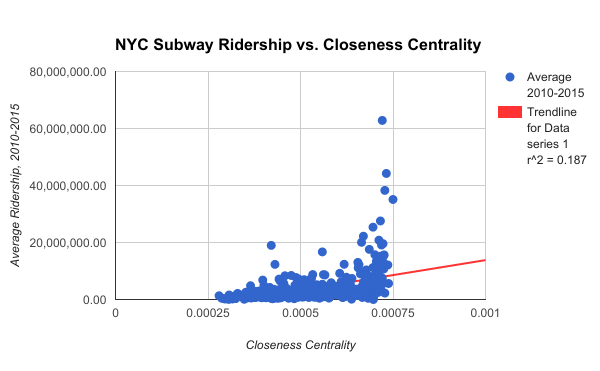
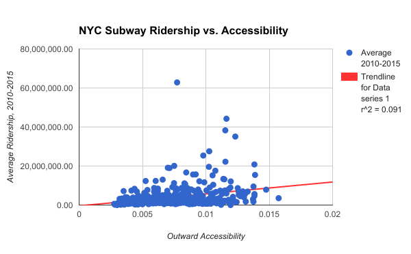
The correlation coefficient for these two data sets show a moderate positive correlation.
- Closeness centrality, r = 0.43
- Outward accessibility, r = 0.30
Remember, correlation does not imply causation, but these figures suggest that for an increase in the centrality metric, you can expect a moderate increase in ridership.
Did you notice Times Square on the scatter plots? Yep, with an average annual ridership of almost 63 million, it’s the outlier. Based on its position on the horizontal axis, closeness centrality thinks Times Square is an important station in the network, while outward accessibility does not. If you remember from last post, PageRank also finds Times Square to be important and Katz just confused us all. That answers our first question!
Before we go on, I have a theory that any outlier in these plots are the result of externalities. For example, the average ridership at Yankee Stadium – 161 St is 8.7 million, but its neighboring stations have ridership of 1.3, 3, 3, and 4.3 million each on average. What is its externality? The world-famous New York Yankees. Times Square – 42 St is a similar situation. Not only is it a transfer point for 12 NYC subway services, it is also below the mega tourist attraction and its namesake, Times Square. I have no hard data on this outliers theory, but more research could be done on this!
Can all stations in a transit network be important?
Why would we want all stations to be “important”? If our goal is for all citizens to have equal access to quality to public transportation, we would like everyone to live near a station which provides this gateway. A transit network will always have stations which are more centrally located than others, but is it possible to minimize the differences between the most connected and the least connected stations? Let’s see how do our metrics evaluate the structure of another world-class network in this regard. Enter Paris, its minimal geographical constraints, and its lovely radial network.
The two histograms below sit on the same range on the horizontal axis. The count on the vertical axis is the number of stations which fall into the horizontal range represented by its bar. As you can see, Paris has many, many stations which score higher than all of New York City’s.
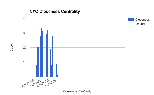
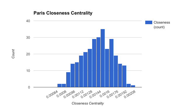
There is one large caveat here: land area. Officially, the area of New York City is 302.6 square miles, while Paris is only 40.7 square miles. Another metric is longest subway line: New York’s A train extends 31 miles, while Paris’ Line 13 is just over 15 miles. Closeness centrality uses shortest path between station pairs, which in my graph, are the number of seconds for a trip. A 31-mile subway trip will take longer than a 15-mile subway trip, so this metrics are stacked against New York City subway and the large area it covers.
Concerning our question, even though Paris’ stations score much higher than New York’s, they are not all equal. This gets back to my earlier point: there will be an importance continuum among stations, but improving the importance of the least connected stations can still provide a benefit to citizens.
Next, let’s look at this histograms for New York and Paris outward accessibility scores.
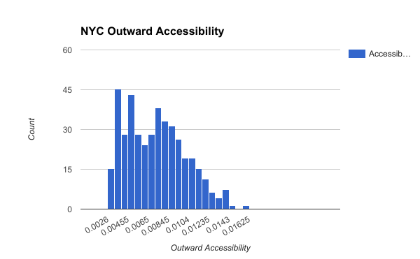
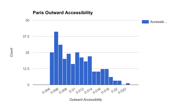
There is not as much difference between New York City and Paris in the histograms for outward accessibility. This metric is independent of network area or subway line length, so this does not surprise me. It may hint that more of the difference between the networks for closeness centrality may be due to geographical area.
If you look at the densest parts of the Paris network and see how interconnected it is, the upper bound for its accessibility distribution being higher than New York’s also will not be a surprise.
Next Stop
Now that we have evaluated the centrality of multiple transit networks and performed limited cross-network comparisons, I want to know whether these metrics can tell us the best future subway routes. For example, given the budget for a single new subway line, what is the best route for this new line? It will be a very empirical and barely human analysis, so we may have to take the results with a grain or six of salt, but hopefully the results will have value besides making shapes on maps.
See you then!
