
Strike Three! 84% Chance that was a Slider
I used TensorFlow to classify baseball pitches. Here’s the backstory! Alternatively, you can skip straight to the Jupyter notebook.
“Four-seam fastball. Easy.” I gave myself a pat on the back as I opened the MLB At Bat app the confirm my pitch classification. After learning to keep score, being able to identify pitches was the next step in my baseball mastery. Well…baseball-spectator-having-never-played mastery. Basically, maximum 10% mastery of someone who had actually stepped foot on America’s diamond.
“Sinker????? Hmm.” It was not a four-seam fastball. My ego turned to tag up back at first.
I get great joy from listening to people who love baseball talk about baseball. They can see an extra dimension or three that the rest of us cotton candy lovers do not know exist.
“Look for him to pound the bottom of the zone today with that fastball / changeup combo.” That is great insight! The type of insight that gives a scoreless game in the 6th more meaning than potentially an early trip to Parking Lot A or the 4 train.
I decided that if I ever wanted to produce that kind of insight, I had to at least be able to identify one pitch from the others.
A two-seam fastball was pretty easy. Mid-to-upper 90s that runs in late on the batter during a rightie on rightie matchup. It also seems that every pitcher who throws a two-seam throws it every pitch, giving me ample opportunities to feel confident. One Sunday Night Baseball game between my newly adopted Yankees and rival Red Sox featured several. I remember exclaiming to my equally novice friend Aaron, “You see how it runs right!?” He nodded. We were hooked. Or at least I was.
It finally hit me that commentators were not performing a fully-stateless classification. “I will watch the next pitch as if it is thrown by a robot I have never seen throw before.” Not quite. Commentators have their own heuristics such as personal experience with pitch sequencing and the infinitely useful scouting report. Before each game, they will review each starter’s pitch breakdown, the expected velocity of each, and common usage patterns. For the home starter on the home broadcast, there is also the advantage of quantity; these commentators watch this pitcher every 5 days all summer. When I started to look at it this way, of course they should know a catchy line about a “fastball / changeup combo.”
I decided I needed to take a different angle. I was not going to sit in the booth 162+playoffs times a year. But I did have a computer.
I began to think about pitch classification with the engineering mindset I used on way too many other things, like transportation systems, eating schedules, and relationships. I wondered how the MLB At Bat app could always produce a classification in the time it took for my gameday view to receive the latest push. Sure, I took some issues with their classification, but you had to respect how timely their labels were.
I remembered reading an article (in the Economist of all places) about the detection systems installed Major League Baseball parks last decade for the collection of hoards of game data. PITCHf/x was the equally startup and technical name to come out of an institution called MLB Advanced Media. If I could get my hands on this data, maybe I could become a Major League Classifier.
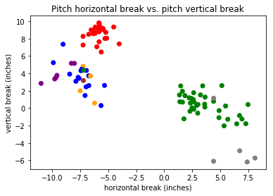
After a grueling 25 minutes of Googling, I decided that Brooks Baseball would be my definitive source. For a given pitcher during a given game, Brooks had an easily parsable table which included velocity in MPH, horizontal movement in inches, vertical movement in inches, and, most importantly, a human classification. I chose Yankee’s ace Masahiro Tanaka’s pitches during his June 17th, 2019 outing against the Tampa Bay Rays. It had been a strong outing for Tanaka, a complete-game, 2-hit shutout. This meant his 111 pitches were probably some of his best stuff, containing the biggest differences between pitch types, and therefore the easiest the classify.
I opened up some lecture notes from an online TensorFlow course I had taken earlier in the year. TensorFlow is the popular machine-learning library developed by Google and embraced by the Python community. A main example in the course had been using neural networks to classify images of numbers (the MNIST dataset) as the actual number they represented. We had created a model using a set of labeled data, which is known as supervised learning. As you’ll recall, the pitch dataset I tracked down included a label on each pitch. A great place to start!
From here on, the discussion dives technical. I used a linear classifier and a dense neural network classifier, both included in TensorFlow, to evaluate the test data set with their predicted types against the provided labels. The linear classifier achieved 72% accuracy, while the dense neural network classifier achieved 84% accuracy. Both of these numbers were higher than I expected and significantly higher than my performance against MLB At Bat.
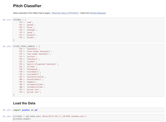
I performed the entire exercise in a Jupyter Notebook and saved a static version (jupyter nbconvert to the rescue!) for easy viewing. Jupyter is a great tool if you want to rerun your experiment with small tweaks and see the affected output on every line. It’s hilarious and valuable at the same time. You know that small hesitation you have when you rip out print statements between every line after you’ve successfully debugged an issue? With Jupyter, hesitate no more!
For the scope of this activity, my output, in addition to the accuracy numbers, is the table at the end of the notebook showing a real pitch label and the label produced by the two trained models. At first glance, the labels look solid! But digging into the data reveals a different story. For the four-seam fastball, slider, and split-finger fastball, all but one of the pitches was classified correctly by both models. For the sinker, changeup, and curveball, none of the pitches were classified correctly by both models. It is worth noting I’m using a terribly small data set, but this is still a thought-provoking split.
The next step for this project would be to explore ways to visualize the difference between these two models and potentially use the lessons learned to write a custom model. Perhaps this model uses more input data (spin rate, for example) to more accurately classify those pitch types my simplistic models struggled to identify.
It would also be cool to systematize this analysis into a real-time system which could identify that game-time insight of “Does this pitcher have their best stuff today?” If you were to consume real-time PITCHf/x data from MLB, classify each pitch, and compare each pitch to past pitches of that type from that pitcher, you could begin to answer that metric. And that sounds easier to me than retroactively experiencing a full baseball career. Who needs the eye test when you could build a real-time distributed data processing system?
Until I build that system, I plan to keep allowing the MLB At Bat classifications take me on an emotional roller coaster and attempting to create three-dimensional pitch plots inside Jupyter Notebooks. I understand baseball pitches slightly better now than before this project. Gradual understanding: now that’s what I call America’s pastime.